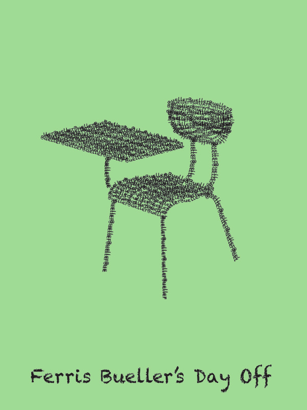
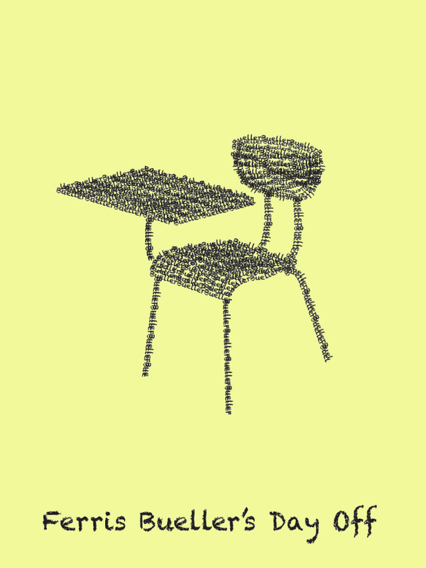
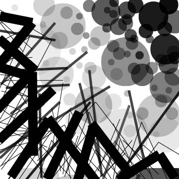
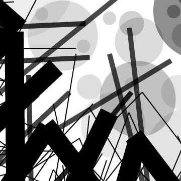
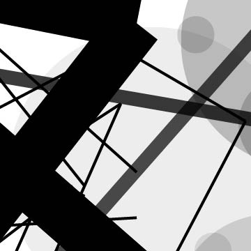
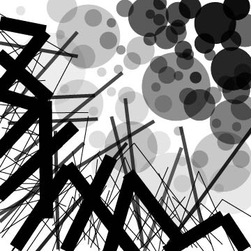
Final "Zine"


Assignment Seven
This assignment involved creating a movie poster using a combination of techniques to create a unique composition. I chose to elude to a famous scene in my chosen movie, in which the teacher calls "Bueller" several times during attendance even though Ferris is clearly not present.
|
|
Exercise Twelve
In this exercise, the concept of each given word was to be expressed using only that word in text form. Only one font was allowed per composition.


Exercise Ten
One photo from the research done in exercise nine/ assignment six was altered with filters to create a new version of the image. The alterations below are decreased contrast, increased contrast, decreased saturation, and increased saturation, respectively.


Exercise Nine
Photos were taken throughout the day to visit common aspects of life that we don't always notice. I chose to zoom in on specific aspects as well, such as hair style and eye makeup.


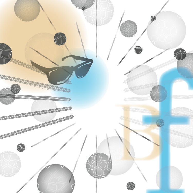
Assignment Five
The object from exercise seven was added to the final product from assignment four. Process photos included.


Assignment Four
This assignment combined exercise six with assignment three to create a new esthetically pleasing composition. Some color was added as well. I chose colors that reflected a sunny day, which I thought connected with the movie choice fairly well. Process photos are included.


Exercise Seven
This exercise transformed an object which could be used to represent the popular movie chosen from a 3D to a simplified 2D form. I came up with two versions of a finished product.

|

|
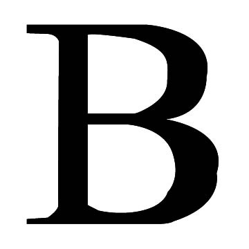
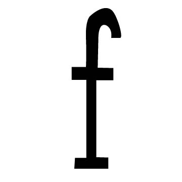
Exercise Six
This exercise continues with the movie theme. Letters were found in everyday life (buildings, signs, etc) and were transposed into flat figures within Illustrator.
|
|
I left the edges a bit rough because I think it adds to the originality of the letter forms. Although references were used to create the basic letter, I wanted to extend beyond that creatively, while not distorting the figures to unrecognizable proportions.
Assignment Three


Researching Helvetica: The Neutral Typeface
Helvetica was created to prevent distraction from the text with the text. Intricate Victorian style text popular before helvetica was seen as artistic - and therefore was art in itself. Thus, the art of writing was overshadowed by the art of visual text. When helvetica was created, Eduard Hoffmann was attempting to end this effect in order to rival the local competing newspaper. Since its inception, helvetica has been used in countless logos including 3M, Microsoft, American Apparel, American Airlines, Motorola, Panasonic, etc. It has also been used in the space shuttle and a multitude of typography artworks.
(Summary of info from http://www.fonts.com/font/linotype/helvetica)
(Summary of info from http://www.fonts.com/font/linotype/helvetica)
Exercise Five
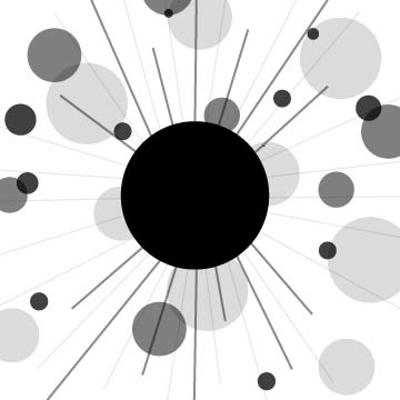
This exercise explored organic shapes and the effects editor in Illustrator to create interesting images. Six organic forms were created and then combined to make one final composition.


Exercise Four
This exercise took one of the finished products from Assignment Two (pictured below) and zoomed in on it twice to create two new compositions. Process photos are included.


100x |
200x |
400x
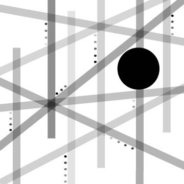
Assignment Two
The purpose of this assignment was to create the essence of three words connecting to a popular movie using the basic elements of point, line, and plane. Process photos and inspiration are included.


RELENTLESS |
LOVE |